Posts

Showing posts from January, 2024

Fun with Color

Image
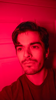
I got myself a new light to practice more with external lighting, and instead found myself playing around with the color/mood of the shots a lot more. While keeping myself in similar poses, I wanted to see how the angles and colors of each shot let to a different feeling.  With the shots displayed, the only major changes were the lighting of each. Red clearly gives of a more dramatic, lively feel. In my eyes, I see very much a nighttime bar/music venue just with the lighting alone. The image saturated in red gives the impression to the viewer that there is a large amount of activity on the other side of the camera. When we take a look at the yellow shot, despite a similar composition a different conclusion is drawn. In my eyes the yellow shot seems to be taking place in a shopping center or a city hotel lobby late at night, and while there is still something going on behind the lens, it is not nearly as rowdy as portrayed in the red shots.

Bright Lights in Small Cities

Image
       Finding inspiration in areas that aren't typically lauded by many as places for creativity has always been fun to me. People see places like London, New York, and other large cities as the sole hubs for the creation of something unique. While I can't deny the draw these historical cities have, I want to find more inspiration in locations that people don't find as massive as these supercities. Take these quick shots from Des Moines. I took these in 2018 and I have held onto them ever since because they showed me something I found exciting. In shot one, a bridge illuminates strong and red against the water and night sky surrounding it. This shot is one of my favorites because the framing can fool the viewer into believing that this bridge covers a river that lets out into the ocean, rather than into a landlocked city. In the second shot, an outdoor amphitheater focuses your attention onto the Hall of Laureates, making for a pleasant viewing experience during a late sum

Beauty, Brutalism, and Belief: a Selection of Architural Themes

Image
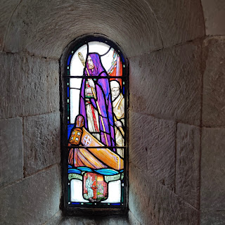
    The vast diversity in architecture across even just a cityscape has always been an interest of mine. The designs incorporated into a region's buildings often diffuse the identities and beliefs of the people who create them. Even the most simple design choice can reflect the feelings of an artist or serve as a snapshot of the emotions and priorities of a people for future generations to analyze and process. The first image shown below is taken from Edinburgh Castle, located in Scotland. Here, we can easily draw the conclusion that our designer has a belief in a deity, and has immortalized the stance of the members of this castle at the time of creation. The colors all serve to draw the eye and display the status of the subjects of this glass panel. In the second image, color takes on a different purpose. Rather than to signify status, we can take the colors of Carnaby to reflect a much different perspective. The arresting pink of the corner building serves as a beacon to creativ

Lower-light Self Portraits

Image
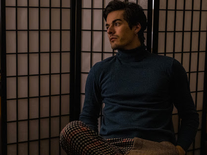
    Inspired by cinematic style shots, I have curated the selection below to display a more simplistic setup for photography. Using store brand lamps, a phone flash, and a tripod, I found it was still possible to create a fun lighting situation that reminds me of a still from a movie. I find myself making photos much cooler in light temp, so with these low light shots I wanted to try and experiment with a warmer hue.   

Mobile Macros: Plant Life Through a Pocket Lens

Image
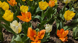
      By now it's no secret that our phones possess cameras that can process more information than even the most advanced cameras 10 years back. I wanted to use this to my advantage and create images that can dazzle the viewer with colors and light I wouldn't have imagined would come from a phone. The bottom two images are shot so that they would make a perfect background on most phones. In this image, it would have been very easy to maximize the colors from the petals, but I wanted the vivid green to punch through the center of the photo without much effort.  

Self-Portraits in a Retro Styling

Image
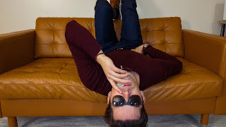
    What better way to test my photography mettle than to make myself the center of the shot? Any errors might reflect better when I see myself with an unflattering lighting or see a crop that doesn't play well with my proportions. The selection below draws from what I would describe as the rockabilly era of America, where volume clashed with fun colors and classic styling.      This first pose is meant to take from the off-beat styling of early rockers. I'm not sure this needs much explanation. Buddy Holly probably has a shot like this somewhere. A take on a backstage shot that one might find in the autobiography of an early rocker.  

Precision

Image
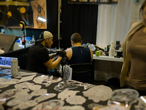
 The photo presented below is meant to display a moment where the subject was deep in focus, almost displaying a meditative state while performing certain activities.     In this shot, I captured a tattoo artist in the middle of working on a large arm piece that required five hours of dedicated work on his part. The dedication required to this art is displayed on Ronnie's face, as we can see even from his profile the laser-sharp attention he is placing into this work. Tattoo artists such as himself may be asked to work on a variety of piece, and seeing him work on this one leads me to believe it's one of the more fun pieces he has worked on.

My first Published Image

Image
  Please enjoy my image taken at the Henry Doorly Museum located in Omaha, Nebraska. I tried to best let the vastness of underwater life shine through in this image. Even as our wonderful fish friends take up lots of the frame, we still can clearly see how they are consumed by the eternal blue water surrounding them. Nothing brings more calm to me than simple aquatic shots like this.